The little word "intentionally" means something like "consciously; purposely; with will". Gabriele Fasching takes this literally. She consciously accompanies people a part of their way - with the purpose of strengthening (leadership) personalities. And not just intentionally, but intentionally. A message that the new corporate design conveys at first glance.
About the client
For 27 years, Gabriele Fasching has been helping people who want to bring out the best in themselves and their personalities. Her daily work is as much about personal stories as it is about hard-hitting business. The trainer and mentor advises people with rough edges, sets accents and connects. All of this is evident in the logo, the centerpiece of the new corporate design.
The challenge
A logo, or rather a new corporate design, always brings challenges. In Gabriele Fasching’s case, it is her fascinating profession, which demanded a special sensitivity for colors and shapes. Due to these restrictions, it was not an easy task to find a suitable combination of expressive colors and the appropriate shapes.
Objective
A logo that does justice to the structured way of working in the personality trainings through special clarity. At the same time we made sure that the already mentioned corners, edges, accents and connections are already visible in the logo by discreet interventions in the typeface.
| Client: | Fasching Gabriele |
| Services: | Beraten, Gestalten |
| Link: | www.absichtlich.com |
| Year: | 2019 |
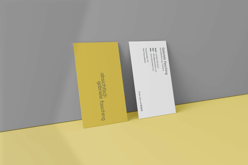
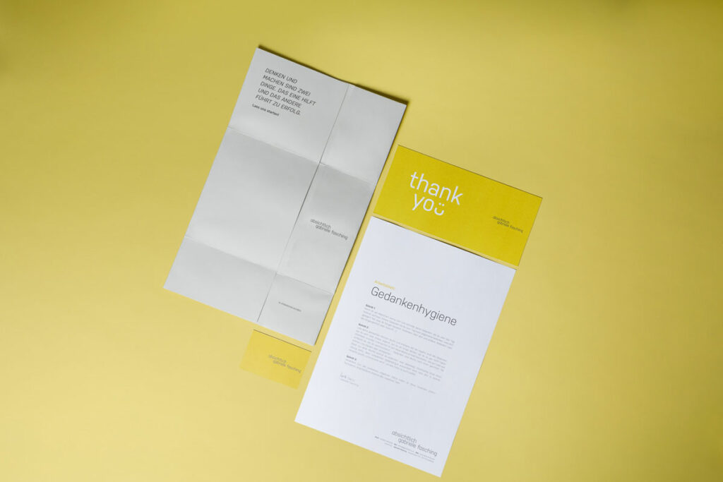
Gabriele Fasching loves to break new ground. And we were also inspired by this when designing the logo. Instead of the classic combination of lettering and graphic elements, we worked exclusively with typography. The central colors of the new corporate design are yellow and dark gray. While the yellow reflects Gabriele Fasching’s cheerful, radiant personality, the gray stands for professionalism and clarity. The use of color code and logo on website, business cards, stationery as well as presentation documents ensures a coherent visual appearance that underlines Gabriele Fasching’s intentions in an appealing and clear way.